Disclosure: This post has affiliate links. I earn a commission at no extra cost to you. I only recommend products I personally believe in. More info on my Privacy Policy page.
Pigtek Website Redesign and SEO
The Problem
Online marketing took a backwards step
Pigtek had commissioned a local agency to build them a new website, but shortly after the new site went live the company noticed that enquiries from the website had dwindled to almost zero. Pigtek’s directors initially contacted SEO CoPilot to look at the sites search engine optimisation however our site analysis revealed some important errors and omissions that contributed to the decline in business from the site.
These problems included:
- Poorly categorised products and services
- SEO Fundamentals missing
- Errors in code and website compliance
- Not integrated with social media options
- Poor content presentation
- No privacy statement
- No calls to action
- Slow loading speeds
- Not mobile device friendly
After meeting with the directors and showing the reasons why they were not getting many results we started a campaign to re design the website and create a sales funnel.
The Solution
Responsive Mobile Friendly Design
The mobile version of the old site was a big problem even though it did work on mobile devices already. We identified that many clients may be looking for Pigtek’s products and services in ‘emergency situations’ – problems with pipelines out on site, rather than in an office. This means that potential visitors could be mobile browsers with poor connectivity.
The speed of the site needed to be improved and we felt the current design was not good for visitor conversion.
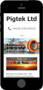
Before
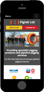
After
We designed the mobile version of the site to give very clear calls to action – primarily to make contact either via a button that would dial from the users mobile phone or to make contact via a form that would pop up (faster than taking the visitor to a contact page).
We also ensured that the company’s vital messages and trust factors were visible above the fold (on the screen without having to scroll) which is important for improving conversion.
The other pages of the site benefited from the re-brand making them far more appealing to visitors.
Branding
We all know that first impressions count. We felt that Pigtek’s look at the time did not reflect the quality of the company’s products or would appeal to their customers. The site was very ‘vanilla’ and branding was virtually non-existent. This was fatal as Pigtek’s target market include some global brands – buyers from these household name companies such as Shell and Texaco would expect to deal with companies whose attention to detail was exemplary – and Pigtek’s whole look was coming across as an afterthought – not good!
 Firstly we looked at developing a brand using the products as our inspiration. The bright red and yellow of the pigs was a great place to start. The fact that the pigs themselves would be consistent with the company’s branding and would represent them whilst out in the field was an added bonus. We added a warm, deep grey to add some gravitas to the colour scheme, which also let the red and yellow really shine out without looking cheap or too ‘basic’.
We also developed a new logo incorporating the new colour scheme.
Branding Integrated into Social Media
We continued the revamp throughout the company’s social profiles giving the consistency needed to make an impression when dealing with global brands.

The Facebook page before we updated it with the new artwork.
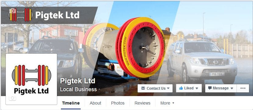
As you can see the new branded artwork gives a far more professional image, we also rolled out new artwork for their Twitter and Google+ business pages too!
Visitor Conversion
We continued to work on conversion rates on the desktop and tablet versions of the site by keeping important calls to action above the fold. These were either a very obvious form or a button that opens a form in a pop up window.
Inner pages also needed their potential to convert visitors to customer. We added a sidebar with a contact form and downloadable brochure to satisfy two states of visitor:
- “I’m convinced – I need to make contact to book their services”
- “I need more information”
We like to satisfy the impulse to make contact once the decision is made without putting obstacles in the way. This is why we use the simple system of making contact from the page, not navigating away.
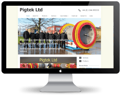
Before
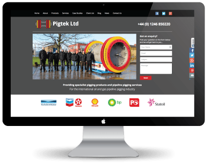
After
Search Engine Optimisation
Ingrained into the site redesign was the need to improve the sites visibility to search engines. Web design is not all about presentation, it’s important to satisfy both clients and search robots needs.
After our keyword research we re-categorised and re-wrote some of the pages to include vital keywords in the content and titles. This means that images had relevant titles and alt description tags, that page and category titles included the correct keywords and that all content was neither under nor over optimised for the chosen keywords.
SEO is also in the code of the site – all our sites are hand coded and designed in house – so we can ensure that everything we do is 100% compliant with Google and other web standards.
The addition of pages such as privacy policy further signal to Google that they are dealing with a legitimate and responsible company.
Conclusion
We continue to improve the signals Google and the other search engines want to see on a monthly basis, Pigtek are moving up the search engines nicely and the increased sales calls have the directors smiling. If you feel your company is in need of an overhaul by SEO CoPilot then please use the contact form or call us on 01246 540 869 we have clients worldwide so dont worry if you are not local to us.
